Bridging Tradition and Innovation: Haywards’ Rebrand

The Partnership
From 1982, HAYWARDS OF KNIGHTSBRIDGE has set the standard for quality cleaning and alterations services in Knightsbridge, London. Renowned for their attention to detail and luxury service, they serve clients from high-end boutiques, exclusive hotels, and the well-dressed residents of Knightsbridge, Belgravia, and Sloane Square.
Our partnership with HAYWARDS focused on preserving their legacy while infusing it with new energy through rebranding. This collaboration, helps HAYWARDS strengthen relationships with their loyal customer base and attract a new generation of clients. By combining nowadays trends with their timeless values, we positioned HAYWARDS to flourish in a modern market while maintaining their reputation for excellence.
The task
HAYWARDS OF KNIGHTSBRIDGE approached Digital Freedom with a request to rebrand their business in a way that would honour their longstanding values and identity while aligning with the trends of the modern market. The goal was to create a refreshed brand image that could bridge their rich history with current customer expectations, ensuring they remained relevant without compromising their heritage.
The challenge
HAYWARDS OF KNIGHTSBRIDGE had spent decades building a premium, trustworthy brand steeped in luxurious British traditions. However, in today’s fast-paced market, standing still is not an option. To stay competitive, HAYWARDS needed a way to evolve their brand, embracing change to appeal to a younger, modern clientele while ensuring that their deep-rooted values and identity were preserved.


The Solution
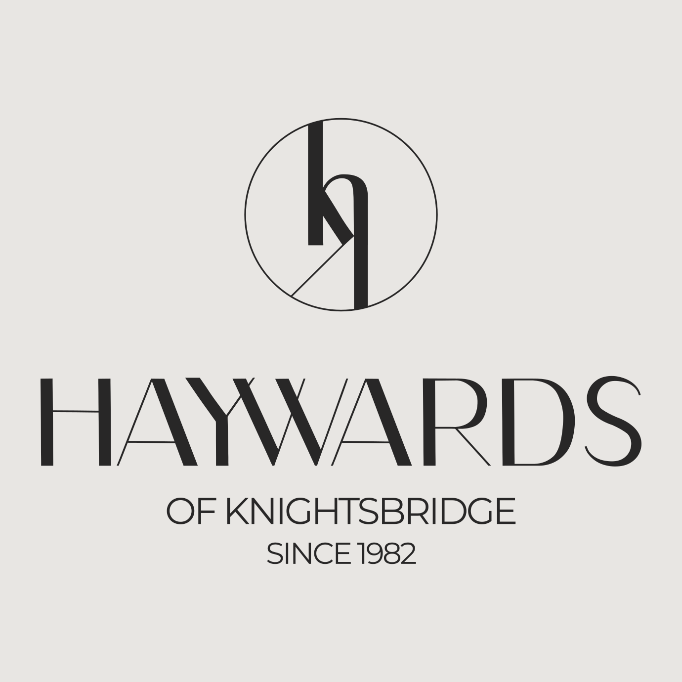
Our approach centred on creating a refined brand image that captured both the timeless elegance of HAYWARDS and the expectations of a contemporary luxury audience. The centrepiece of the rebranding was the logo, designed to honour British traditions while reflecting the unique character of Knightsbridge. We developed a logo with intricately intertwined initials, inspired by classic British typographic styles, symbolising sophistication and exclusivity. This not only pays tribute to British heritage, but also represents the connected streets and green spaces of the area, firmly rooting the brand in its local legacy.
The Result
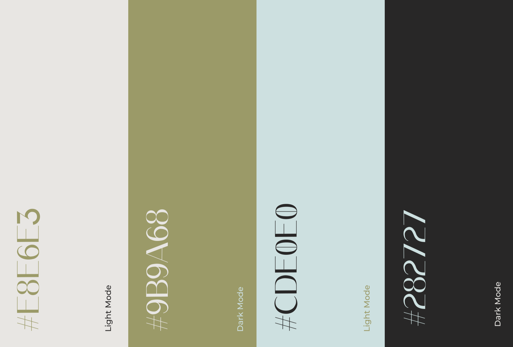
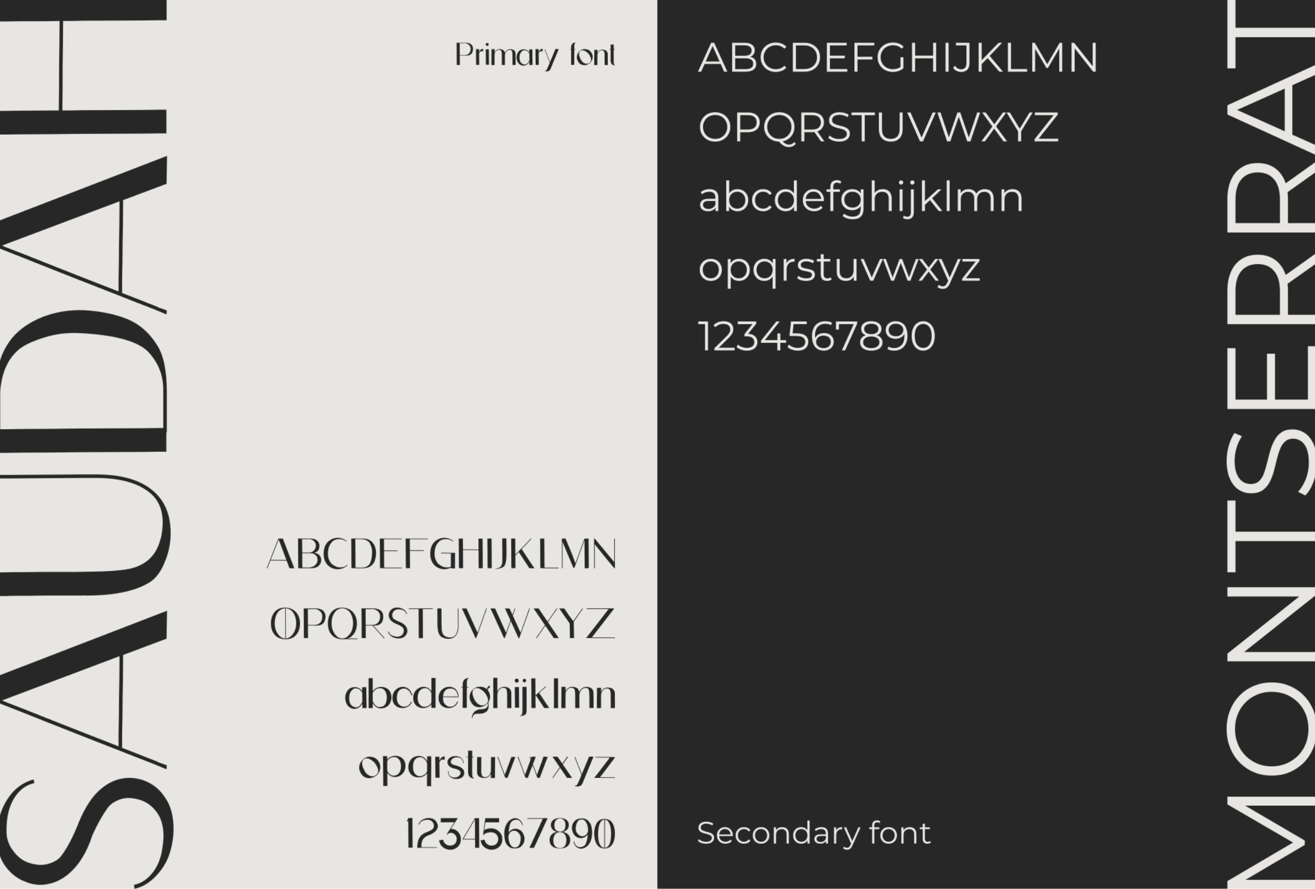
We extended this new identity through a cohesive visual system using a sophisticated colour palette and elegant typography. Every design element reinforced the image of HAYWARDS as a luxurious, trusted service provider, creating consistency across all brand materials. The result was a revitalised brand that balanced modern appeal with the timeless qualities that clients had come to expect.


 back
back